Starting Point
Greetings and thank you for spending time with NILnomics today.
Last week I took time off for family and holidays. This week - I’ve got several analysis still in the oven cooking, so I’m going to take this time to review some of the best visual guides I made the past year. I have a lot of new readers who haven’t been here from the start so I’m hoping everyone can find something new, interesting, and useful here. I’ll be back next week with some new analysis you’ll love.
Onto the top 10!
10. Student Fees
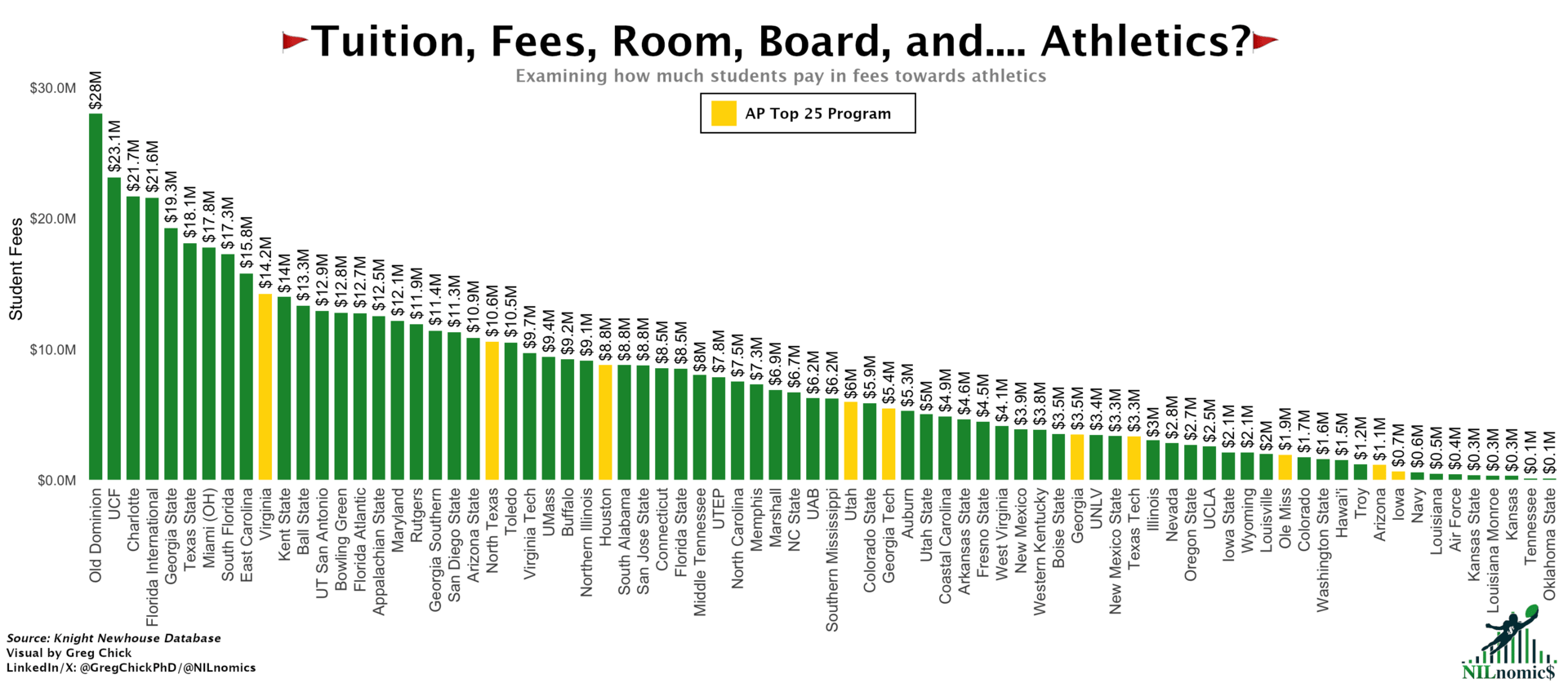
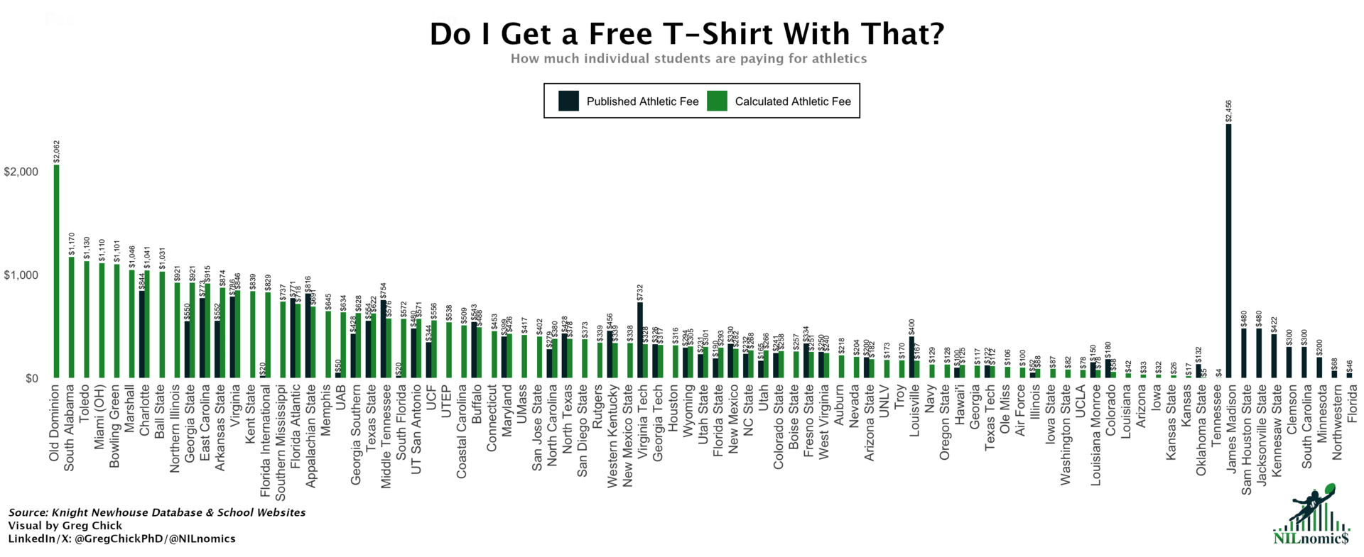
Maybe it’s not fair to use the last issue in this list, but so be it. It took alot of work to go over every FBS schools’ website and figure out if there was an athletics related fee. Interestingly, that was going to be all that I did. Then I had the thought to use the student fee data that schools report on their MFRS reports. And that’s how we got these charts.
I might dig into these a bit more. There are some interesting patterns between the schools explicitly charging athletic fees and their conference membership/on-field performance. More to come on that…
I can’t get enough of attendance data. Yes, I know this is reported attendance and not actual ‘turnstile’ data but this is what I have to work with. There’s something fascinating about how many people are coming out to these games. And honestly - these attendance figures always have to match the eye test when they’re all being broadcast each week. It’s incredible just how many people are going to those top B1G/SEC games - whether in raw headcount or % of capacity. And how much of the overall college football fan population is going to games in those conferences. I guess it just means more.


This may be my favorite chart if not the most interesting data. I don’t think anyone is surprised to see that ticket revenue went through the roof for Iowa while she was there. It is interesting to see just how big the gulf is between them and every other team.
I’m excited to see what FY2025 data says for ticket sales. I can’t imagine they’ll keep momentum going but I hope they still tower over everyone else. Stay tuned for that.

If you do these conference sorted bar graphs enough times you tend to see the same schools in the same positions. But when looking at social media - there were some legitimate surprises! I think I’m struck by just how few followers the G6 and most Big 12/ACC schools have. How can that be? Are these schools not investing in social media teams? May need to follow that up.

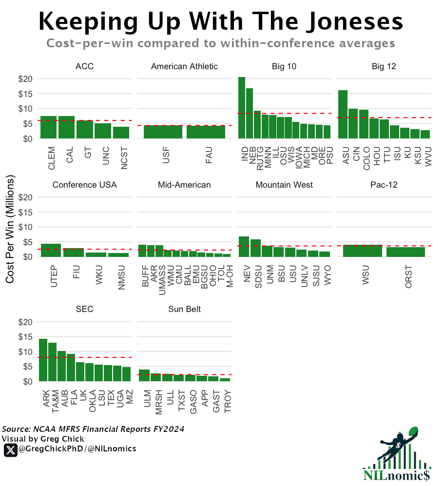
Everyone knows that it’s all about the wins you have at the end of the season. But one of the focuses of NILnomics is to look at the money these athletic departments are spending. Thus, these charts are fundamental to what I’m doing here.
The patterns you see from these charts are high cost, underperforming top schools (Indiana) rank highest while small budget, reasonably performing teams are the lowest. The conference based analysis also shows the peer competition from a better perspective. You can tell schools are benchmarking their expenses with each other.
I love seeing the grid view and can’t wait to update this when new data comes out this month. I suspect Ohio State and Indiana will take the spot currently occupied by Michigan, if not higher up on the y-axis.


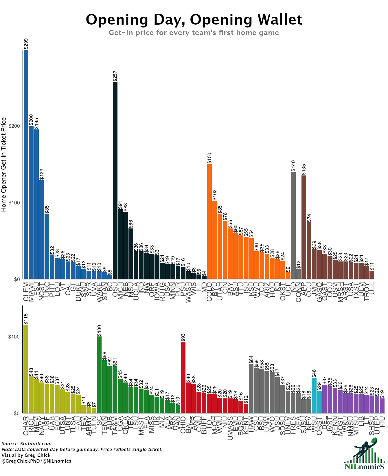
I have a soft spot for this chart just because I know how much work it took. I had to look up ticket prices the day of/night before each school’s home opener. That sounds simple, but it’s a lot of work! I have found some better resources to get at this data since then, so I can look back fondly on the brute force this took knowing I can do it much easier next time.
This newsletter started amidst the House settlement case being decided. Many of my first issues were around the roster limits. I thought these charts were the best ones to come out of that. It’s astounding just how many athletes lost roster spots at some of these schools. This makes me think I haven’t seen much reporting on this now that the settlement has gone into effect. Someone should follow that up!
I also thought I saw right through the Ivy League not opting into the House settlement. They clearly have plenty of student athletes taking up spots that, let’s say, may not have earned it in a traditional way. Even in a post-Varsity Blues world, Ivy schools are sneaking their nepo babies in through athletics. Obviously.


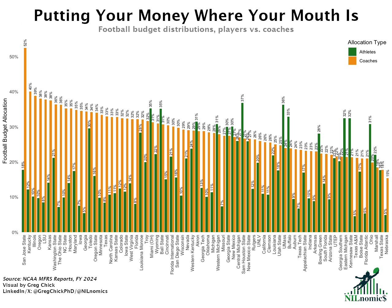
Given this was the first time we ever earned any type of shoutout, I had to put these charts here. Also, I think it’s grossly underreported what these coach contracts are worth compared to what the players are getting.

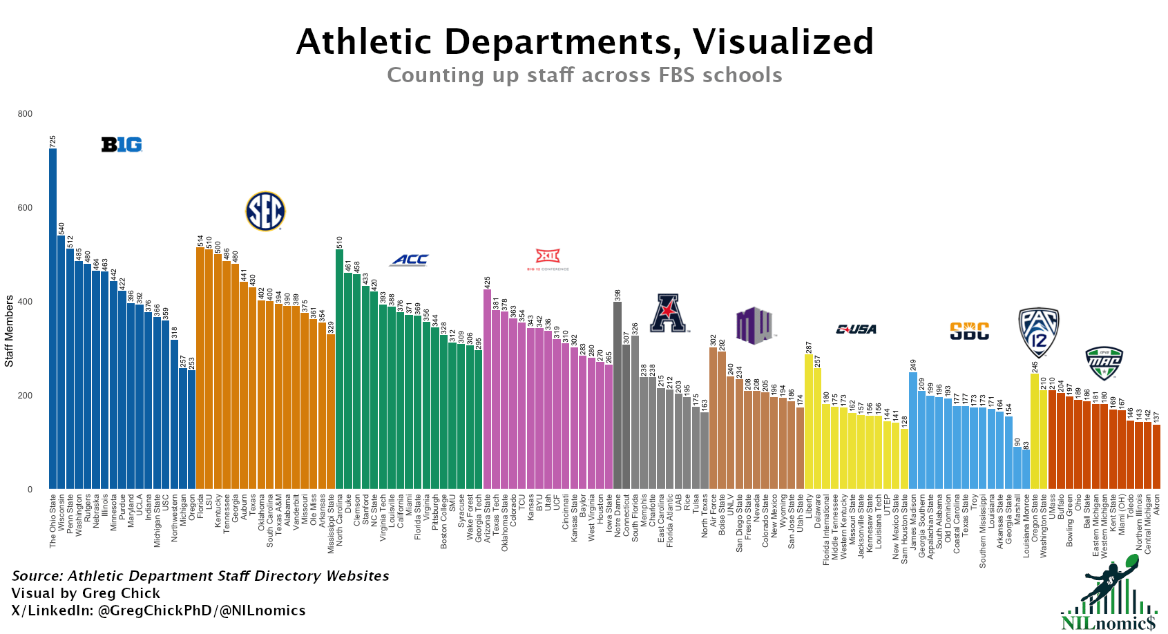
I spent a lot of time scraping the athletic staff directory pages. That data is going to be used for a lot of analysis going forward, but for now this is my favorite visual. It’s wild to think just how desperate schools are, even within the same conference.
1. Salary Cap
Maybe the most important chart I’ve made because it’s what originally inspired me to start this newsletter. How has no one else put together a visualization of these schools’ pool revenue and the cap?
I’ve used this chart so many times, either when arguing how the G5 is so poor or why many schools can afford to pay student athletes over the cap. This chart is just fundamental to the college athletics space now. Hang it in the Louvre.

The End
Thanks again for reading today’s NILnomics. It’s been an exciting start as the newsletter only began in April 2025. I hope to continue to provide you with college sports analysis you can’t find anywhere else.
The next few weeks I’ll be looking at mens/womens basketball staff sizes, athletic directors’ backgrounds, Learfield Directors Cup data, CFP ticket prices, and more! If you have any ideas, thoughts, or feedback - just reply to this email.
Best,
Greg Chick, PhD
Data Analyst